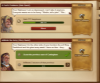
• Dear forum reader,
    To actively participate in our forum discussions or to start your own threads, in addition to your game account you need a forum account. You can
    REGISTER HERE!
    Please ensure a translation in to English is provided if your post is not in English and to respect your fellow players when posting.

Feedback [Feedback] - New Quest Overview

  • Thread starter Retired Community Manager
  • Start date

DeletedUser7661

Guest
I've been avoiding doing any quests in beta because of the visual problems associated with the new boxes for the quests. I noticed in the changelog update for the primary servers that it said the quest overview is being polished, which made me nervous. Nervous that the version in beta would hit the main servers soon. So I checked it out to see if it's any better.

Nope. If it goes to the live servers like this, I'll never be able to do quests again. I'm having enough trouble working on GBs in the beta server -- I barely even level my own anymore because I have so much trouble processing the beta version of the GB screen. Please, please don't take that layout to the main server.
The current (live) GB layout is easy to follow. I don't know quite how to explain the problems I have with the one in beta except to say my brain literally cannot make sense of it. I have accidentally leveled my own GBs when I didn't want to because I couldn't tell what I was doing, where the points were, how many I was adding, etc. The ONLY good things about the beta GB layout (as compared to the beta quest layout) is there is no white text, there is no text of any color on a white background, and it pops up in the center of the screen. But that doesn't make-up for being unable to figure out what I'm doing with the GB every single time. And I'm NOT a new player.

If I have to give up doing quests AND working on GBs, there's not much point to still playing the game is there?
This is my favorite game I play. I've tried out others and always come back to FoE.

The beta quest overview is still terrible. And the text seems to have gotten even smaller! Way to make it more difficult to see. :-(
The white background behind text is still painfully bright. Even if I skip reading the text directly on the white, I can't read anything else because it's blinding. And the rest of the text is so small I can barely read it.

Having it stuck on the left side is also a problem too. Off to the side, on top of the itty-bitty text, it blurs. I wear glasses and direct center is where I have my best vision. Off to the side? Not so much. And it's not always possible to move over to the side of the monitor to try to focus better. And it slows me down if I have to keep moving my chair if I want to do a quest.

Not being able to do quests in beta has really stunk. Makes it harder to advance too, because the quests offer up a lot of coins, supplies, goods, diamonds, troops, especially if you do a lot of them. If you can't do them at all?

Please don't take this layout live. I've been playing for several years and I'm not ready to quit playing.
 

DeletedUser7942

Guest
The white background behind text is still painfully bright...the rest of the text is so small I can barely read it...

The text size looks the same to me though I agree they could tone down the white background. In the meantime if it helps you can increase the zoom on your browser window and reduce contrast and brightness on your monitor.

Old New quest2 - Copy.PNG

Browser zoom example/comparison
zoom browser - Copy.PNG
 
Last edited by a moderator:

DeletedUser7661

Guest
The text size looks the same to me though I agree they could tone down the white background. In the meantime if it helps you can increase the zoom on your browser window and reduce contrast and brightness on your monitor.

View attachment 2503

It definitely looks a lot smaller to me from the first time I commented on this thread (July 18). I have a gigantic monitor on the desktop and a small screen on a laptop. Zoom creates more problems than it is worth to use. Zooming back out sometimes doesn't work properly. Or I end up clicking something I didn't mean to while zoomed in. I also have problems where the game locks up while zooming in/out, and then I have to reload and start over (usually forgetting what I was working on in the first place). It's gotten worse since Chrome updated to the latest version. Zooming in on the quests is also not even an option when you're looking at the app version of this issue. Plus it's still locked off to the side, so it's blurry on top of everything else.

Including a screenshot of the quest that I ran through PaintShop Pro. Applied the artistic effect of 'wind' to give you an idea of how it looks to me. (Centered boxes do not have this specific problem.)

(I do like on the app that the story bit of each quest, which I don't care about at all, is only visible if you select it (the little book), but the white background is still there under the book. So even if I don't click on the quest description in the app, I still get the blinding white. Even with my iPad brightness turned way down. They could make the book stop dancing around any time now too. Forces your eye to it. Then blinded again.)

Trust me, I already have contrast and brightness reduced or I wouldn't be able to load any site. I need a lot of actual light in a room, but not on a screen! If I didn't have it turned down I'd have a migraine every time I got online to do anything. :-(
 

Attachments

  • Capture.PNG
    Capture.PNG
    510 KB · Views: 16

DeletedUser7942

Guest
It definitely looks a lot smaller to me from the first time I commented on this thread (July 18). I have a gigantic monitor on the desktop and a small screen on a laptop. Zoom creates more problems than it is worth to use. Zooming back out sometimes doesn't work properly. Or I end up clicking something I didn't mean to while zoomed in. I also have problems where the game locks up while zooming in/out, and then I have to reload and start over (usually forgetting what I was working on in the first place). It's gotten worse since Chrome updated to the latest version. Zooming in on the quests is also not even an option when you're looking at the app version of this issue. Plus it's still locked off to the side, so it's blurry on top of everything else.

Including a screenshot of the quest that I ran through PaintShop Pro. Applied the artistic effect of 'wind' to give you an idea of how it looks to me. (Centered boxes do not have this specific problem.)

(I do like on the app that the story bit of each quest, which I don't care about at all, is only visible if you select it (the little book), but the white background is still there under the book. So even if I don't click on the quest description in the app, I still get the blinding white. Even with my iPad brightness turned way down. They could make the book stop dancing around any time now too. Forces your eye to it. Then blinded again.)

Trust me, I already have contrast and brightness reduced or I wouldn't be able to load any site. I need a lot of actual light in a room, but not on a screen! If I didn't have it turned down I'd have a migraine every time I got online to do anything. :-(

Text size on Browser: What I showed there is that relative to the old system the text size is the same as the new system as it is now on Browser so text wise speaking if you can read the text size on the old system on a browser then it would follow text wise you could on the new system on a PC as well.

Text size on Mobile: Text size on mobile will be determined by the size of the device, and depending on the device might have an option to zoom in the settings. https://www.phonearena.com/news/How-to-magnify-zoom-in-on-your-Android-screen_id61370. I've never had a problem with zooming Chrome in and out on FoE on Broswer also using this latest version; Version 60.0.3112.90 (Official Build) (64-bit).

Regardless if what you posted is what the quest window looks like to you then I don't know if there's anything Inno can do. How have you managed doing the other things that are on the sides like Chat, the info box on the right, your diamond, medal, c/s amounts on top right, game menus on bottom left etc. edit: also you can Window the screen on Browser and move the window center wise, perhaps this is what you have been doing with other off center areas of the game.
 
Last edited by a moderator:

DeletedUser7661

Guest
Text size on Browser: What I showed there is that relative to the old system the text size is the same as the new system as it is now on Browser so text wise speaking if you can read the text size on the old system on a browser then it would follow text wise you could on the new system on a PC as well.

Text size on Mobile: Text size on mobile will be determined by the size of the device, and depending on the device might have an option to zoom in the settings. https://www.phonearena.com/news/How-to-magnify-zoom-in-on-your-Android-screen_id61370. I've never had a problem with zooming Chrome in and out on FoE on Broswer also using this latest version; Version 60.0.3112.90 (Official Build) (64-bit).

Regardless if what you posted is what the quest window looks like to you then I don't know if there's anything Inno can do. How have you managed doing the other things that are on the sides like Chat, the info box on the right, your diamond, medal, c/s amounts on top right, game menus on bottom left etc.

I don't know what to tell you other than it looks smaller to me and I haven't changed anything on my screen. The numbers in particular look much smaller.

I don't have an Android.

I rarely do chat unless I'm desperate (for help on something). If I'm doing chat, then that is all I am doing and and sit closer to that side of the screen. Chat is also using colors which are not so difficult for me to process, which helps a LOT. I do not have this blurry problem with the quest box in the live servers because it is not fused to the side of the screen. The further to the edge, the blurrier it gets. Side edges, that is. The top bar is clear. As is the bottom.
 

DeletedUser7661

Guest
And, please note, that while I used the lowest blur / wind setting, it's still worse in the graphic than my actual vision. But it's the best I could do to give a visual for how it does look to me. It IS blurred. And if I just had to glance at it now and then, maybe I could tolerate it (if there were no other issues on top of the blur). But having to sit and read and process quest instruction isn't just a quick glance. I'm used to being able to one quest after another quickly. That ended in beta with this new quest box. Slows down the game a lot. I play in 9 worlds on the US server. It takes awhile to go through them now, even when I play quickly. If I have to sit and really stare at each individual quest; really focus to try to see it as clearly as possible, I'll have a migraine before I'm done with the first world. I don't know about you all, but that does not equal a good time to me!
 

DeletedUser7942

Guest
I don't know what to tell you other than it looks smaller to me and I haven't changed anything on my screen. The numbers in particular look much smaller.

I don't have an Android.

I rarely do chat unless I'm desperate (for help on something). If I'm doing chat, then that is all I am doing and and sit closer to that side of the screen. Chat is also using colors which are not so difficult for me to process, which helps a LOT. I do not have this blurry problem with the quest box in the live servers because it is not fused to the side of the screen. The further to the edge, the blurrier it gets. Side edges, that is. The top bar is clear. As is the bottom.

Browser example: The numbers for progress got moved and I think maybe appear slightly smaller but they were rather small anyway, difficult to distinguish if you ask me, maybe 1 point font size smaller guessing.

text size example - Copy.PNG

Mobile Zoom/Magnification: For zoom whatever device you're using you can look to find if they have similar magnification settings or there may be possible apps available.

Browser Zoom/Magnification: If one browser is not working you could try another or perhaps try the OS magnifier or other similar program.

Browser example: Also I don't think you caught my edit there but a solution for off center areas of the game is to Window the game and move the needed area center wise on your monitor.

move window to center - Copy.PNG
 
Last edited by a moderator:

DeletedUser4381

Guest
I have already passed it on as an improvement for the app :)

Whilst you're at it, please also mention that the quest requirement should be visible on the first screen. Since I got the new interface I have to accept every quest to see what it is I'm actually being asked to do, before going back and choosing abort if I want to. 50% more clicks already, plus the scrolling to the bottom of the quest window to get the next quest. (To fix the latter, make new quests appear at the top of the window when one is aborted.)
 

DeletedUser7246

Guest
well, today, when challenges and event appeared together, it all gets even worse.
New Icons were designed to make more quests look fine together. That didn't happen. In old versions during the events all 5 icons were small and looked very good together, plus captain. Now there are 3 of them plus captain - and they didn't fit my screen! It's definitely downgrade. And it's definitely hard to switch between different types of quest (events, repeated, challenges) in this scrolling and sliding left book, than just to click between 5 icons.
And it was said already somewhere here hat developers will not return to old system of quest. But could they do at least this icons smaller, as an icon for captain? And please do not do captain bigger...
That all very painful and processor consuming. I like, I very-very like and very-very want an old icons and old system of quests, especially now, when I lived a week with this new design.
 

DeletedUser8381

Guest
I have already passed it on as an improvement for the app :)
Yes, please, because it needs to be a consistent experience. On browser, I can blow through the quests on the most recent update. The problem is I play on mobile 90% of the time because the platform is less clunky and much more responsive.
 

DeletedUser6209

Guest
Then make suggestions on how to improve it.
The new interface for the Quests is here to stay so try to make it better! Just hating on it won't make it better. It could become a really good thing with good advice from us players.
I'm sorry, but there are 15 pages of reviews on how to make it better. It's called roll it back to the old version. Saying it is here to stay, not heeding the multitude of users that are telling you this is a bad "enhancement", will just lose you people playing the game. And if you are the one who wrote this 'enhancement' don't take it personally. It just sucks.
 

DeletedUser7942

Guest
I'm sorry, but there are 15 pages of reviews on how to make it better. It's called roll it back to the old version. Saying it is here to stay, not heeding the multitude of users that are telling you this is a bad "enhancement", will just lose you people playing the game. And if you are the one who wrote this 'enhancement' don't take it personally. It just sucks.
Not really though, the majority of the complaints really were in respect to making it faster, and so they fixed that for the most part on Browser. Mobile still needs work from what I can tell of the comments as I don't play mobile.

We can see now why it makes sense to have the new system with the Daily, Event and Normal(Story, Recurring, Side, Bonus) quests all fitting into that one system.
 

DeletedUser

Guest
I don't like it. The icons are bigger for no reason - and it means that my city is less visible... The scroll down bar is complete and utter annoyance, use more time to see what I have to do. The only good thing is that you can now abort missions without confirmation - but I don't see why it couldn't be implemented in old version?
 

DeletedUser8427

Guest
I have played the game on PC and on a mobile device (md). I prefer den one you have made for pc. There is simply to much text and the quests are difficult to recognise on md. the idea of being able to read more about the quest is a good idea, but should be an option if one have the need. It could be nice if you could make different pictures/icon depending on what kind of quest one chose. Right now it simply takes to long time changing the quests until you get the one you need. But thank for a great game. You guys keep impressing me with new stof.
Your sincerely
Grev Bakke
 

DeletedUser8381

Guest
For the love of all that's holy, please make the confirm abort popup go away in mobile!!! :confused:
 

DeletedUser7107

Guest
Not really though, the majority of the complaints really were in respect to making it faster, and so they fixed that for the most part on Browser. Mobile still needs work from what I can tell of the comments as I don't play mobile.

We can see now why it makes sense to have the new system with the Daily, Event and Normal(Story, Recurring, Side, Bonus) quests all fitting into that one system.
if by faster you mean its no longer a snail, but a speedy turtle, yes you are correct. still way to slow for those of us doing heavy questing
 

DeletedUser7107

Guest
well I see that the interface auto scrolls down to the bottom when the new quest appears there. vwet good fix, this makes the whole workable. Thank you
 
Top