The full stats posts will be added soon.Please add the stats of the windmill and athlon abbey as well, thanks!
-
Dear forum reader,
To actively participate in our forum discussions or to start your own threads, in addition to your game account you need a forum account. You can REGISTER HERE!
Please ensure a translation in to English is provided if your post is not in English and to respect your fellow players when posting.
You are using an out of date browser. It may not display this or other websites correctly.
You should upgrade or use an alternative browser.
You should upgrade or use an alternative browser.
Feedback Soccer Cup 2023
- Thread starter Juber
- Start date
Estipar
Merchant
Its shocking that someone though this was a good idea. I struggled to see how they could make this game worse and now I knowI just hate these:
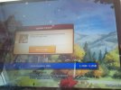
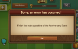
View attachment 9837 View attachment 9838 View attachment 9839 I feel sorry for people with bad sight and other health issues.
BilgeKahan
Farmer
I cannot install beta app by android. I see just One or more files cannot downloaded please try again. I tried 5 times.and everytimes same
Android tablet
install from beta forum
Everytime I deleted the Install 1,261.?(1 or 2)
Android tablet
install from beta forum
Everytime I deleted the Install 1,261.?(1 or 2)
Please check https://forum.beta.forgeofempires.com/index.php?threads/soccer-cup-2023.16372/#post-159054I cannot install beta app by android. I see just One or more files cannot installed please try again. I tried 5 times.and everytimes same
Android tablet
install from beta forum
Everytime I deleted the Install 1,261.?(1 or 2)
Bosun
Farmer
The main building is so bad.
Why are FPs a random prodution vs blueprints? Do top players need blueprints? ("apart from titan ones"), FPs have a much higher value for players than blueprints.
I'm not even going to comment on the fragments prodution part because that's even more dumb.
More attack, more defense, more city attack, more city defense, even more attack, even more defense, more event buildings producing more event buildings. Feels like a neverending cycle. Some players are going crazy with leveling their Blue Galaxy.
Another gold league exclusive building? I see a pattern forming here.
Why is the event window/colors so bright? Turn it down a bit.
This one made me laugh. *looks at the players in my world that stopped playing*
Why are FPs a random prodution vs blueprints? Do top players need blueprints? ("apart from titan ones"), FPs have a much higher value for players than blueprints.
I'm not even going to comment on the fragments prodution part because that's even more dumb.
More attack, more defense, more city attack, more city defense, even more attack, even more defense, more event buildings producing more event buildings. Feels like a neverending cycle. Some players are going crazy with leveling their Blue Galaxy.
Another gold league exclusive building? I see a pattern forming here.
Why is the event window/colors so bright? Turn it down a bit.
And because Forgers never quit, we have even more prizes available!
This one made me laugh. *looks at the players in my world that stopped playing*
BilgeKahan
Farmer
I tried one more from forum beta app store the last version. 1,261,2 ( bei Google play store you have actual 1,258 vers)
Game installed on tablet android(android 10 and aktuell)
Than i Log in with my name and pass
After download the play (1,2Gb)
BUT 99% is ok. Than i see info
One or more files cann not be downloaded. Please try again
?????
Attachments
Have you read what I linked? This is a known issue, that will most likely be fixed tomorrowI tried one more from forum beta app store the last version. 1,261,2 ( bei Google play store you have actual 1,258 vers)
Game installed on tablet android(android 10 and aktuell)
Than i Log in with my name and pass
After download the play (1,2Gb)
BUT 99% is ok. Than i see info
One or more files cann not be downloaded. Please try again
?????
UBERhelp1
Viceroy
Presenting: my version of the Soccer Event!
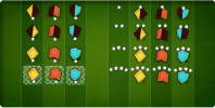
Things to note:
What do you all think?
[EDIT] - aware that there's nothing for the "empty" badges that you spawn. See attempt #2 at this here: [link]

Things to note:
- If you don't have distinct images for each level of player (like different numbers of gems), why not just use the whole shape for right or left? Makes it bigger and more intuitive
- Darker background. Still looks soccer-y, no more color overload. Makes the players stand out more. Also, I didn't change the net art at all. It's just a lot nicer on the darker background.
- More distinct stars. With the extra space we have, you can make stars that are now a bit bigger. I'm not quite happy with my version, but adding a curve to them helps make it easier to distinguish the level of the player. Maybe group the stars closer together than I did, and then there's more distinction between a player adjacent to it?
What do you all think?
[EDIT] - aware that there's nothing for the "empty" badges that you spawn. See attempt #2 at this here: [link]
Last edited:
BilgeKahan
Farmer
Last Post i read nowHave you read what I linked? This is a known issue, that will most likely be fixed tomorrow
FrejaSP
Viceroy
Your colors are much better but what is it with the stars below and full pieces on the net, that's not how the event worksPresenting: my version of the Soccer Event!
View attachment 9840
Things to note:
- If you don't have distinct images for each level of player (like different numbers of gems), why not just use the whole shape for right or left? Makes it bigger and more intuitive
- Darker background. Still looks soccer-y, no more color overload. Makes the players stand out more. Also, I didn't change the net art at all. It's just a lot nicer on the darker background.
- More distinct stars. With the extra space we have, you can make stars that are now a bit bigger. I'm not quite happy with my version, but adding a curve to them helps make it easier to distinguish the level of the player. Maybe group the stars closer together than I did, and then there's more distinction between a player adjacent to it?
What do you all think?
estrid
Baronet
The half-badges are indeed more visible than in the game now, but are you presenting the spawned ones as empty? Then how'd the player now where to merge?Presenting: my version of the Soccer Event!
View attachment 9840
Things to note:
- If you don't have distinct images for each level of player (like different numbers of gems), why not just use the whole shape for right or left? Makes it bigger and more intuitive
- Darker background. Still looks soccer-y, no more color overload. Makes the players stand out more. Also, I didn't change the net art at all. It's just a lot nicer on the darker background.
- More distinct stars. With the extra space we have, you can make stars that are now a bit bigger. I'm not quite happy with my version, but adding a curve to them helps make it easier to distinguish the level of the player. Maybe group the stars closer together than I did, and then there's more distinction between a player adjacent to it?
What do you all think?
FrejaSP
Viceroy
Yes the spamned ones will be a problem, maybe show them as black eith the color at the EdgeThe half-badges are indeed more visible than in the game now, but are you presenting the spawned ones as empty? Then how'd the player now where to merge?
UBERhelp1
Viceroy
True... Not sure how to do that...The half-badges are indeed more visible than in the game now, but are you presenting the spawned ones as empty? Then how'd the player now where to merge?
main question with your version : what would the players without any badge look like?Presenting: my version of the Soccer Event!
PS: Oh, I see... only the stars - that seems a bit meager - maybe an empty outline of the full player?
Carol and Gustavo nose's should be swapped for better looking on them.
FrejaSP
Viceroy
I like the golden upgrade to the main building but what is Mediterranean Memories Selection Kit?The main building is so bad.
Why are FPs a random prodution vs blueprints? Do top players need blueprints? ("apart from titan ones"), FPs have a much higher value for players than blueprints.
Gedrog
Squire
I have just decided I am not wasting my money on this event it is confusing as hell and makes no sense whatsoever too little progress with unbalanced boardsThe graphics plain sucks vs the anniversary event's original variant.
It will be very hard for players to understand and they will waste lots og footballs before they learn how it works.
I fear alot will hate this event.
Retired Guy
Marquis
Graphics are horrible for small screens, or those with less than 40/20 (not a typo) vision.. It talks about "players" eg "32 marked players on the field".. at best they're nothing but symbols, certainly not players.. Perhaps you should have tried beer cans, hotdogs, and popcorn ?? Yes, it's a re use of existing mechanics, but the graphics and layout are terrible.
Share:
