• Dear forum reader,
    To actively participate in our forum discussions or to start your own threads, in addition to your game account you need a forum account. You can
    REGISTER HERE!
    Please ensure a translation in to English is provided if your post is not in English and to respect your fellow players when posting.

Feedback Soccer Cup 2023

Emberguard

Emperor
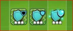
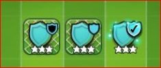
As you might have noticed, we have made a visual improvement for the badges today: Instead of having a left side of a badge, right side and full one, we now have an inside, outside and full, sparkling badge.
This change was done based on your feedback provided in the feedback thread and support tickets.

Please tell us what you think about this change in the feedback thread, especially if it helps you differentiating it more. Thank you!

image.png


Personally I think that's better than before.

The "locked" net is still so close in shade to everything it blends in. A darker shade for the background would make the net easier to see
 

Kronan

Viceroy
Juber - thanks for championing the changes.... I think we're closer, but not yet there. Still having trouble, conceptually, with the FINISHED symbol. I DO like the 2 contrasting generators - but look at these, and see if this idea might work.

What you have now:
new identities-0.JPG

As you can see, when I combine DARK and LIGHT - I get something visually close to light, only differentiated by the "sparkles" of white. Not enough, IMHO.

Now this perspective:

new identities- 1.JPG or possibly even this: Capture 1-1.jpg or even this (yin-yang): Capture 1-2.jpg


Show genesis design (dark and light aka black and white) and then show a CHECKMARK signaling completion. Color independent (so as to value people that are colorblind), but a checkmark is a universal OK symbol - ie, you've achieved the culmination you wanted from a union of dark/light (aka black/white).

Food for thought :)
 
Last edited:

xivarmy

Overlord
Perk Creator
The new icons are faster for my brain to process, even if they don't make a lot of sense as to what they're combining. (feels like empty badge + full badge = bigger-badge more than an outside and an inside).

My last wish in terms of the visuals would be to stick to the layout where all the players are crammed against the right side. So that the spawner isn't hiding loose pieces in the middle of all the frozen ones.
 

drakenridder

Overlord
Perk Creator
Would love to see the dark mode variant. Dark background + bright pieces is giving the best contrast. customisability like @SlytherinAttack suggested could be a great enhancement for events like this.
I would rather like to see in addition a little more though. More accessibility options for colour blindness. Most every day devices have this and it would take only once a bit more work to make but makes a world of difference for those with such conditions.
 

Pass Go

Squire
the change from 1/2 and1/2 to full shape really threw me for a loop.. I thought I had a bunch done overnight by themselves ! once I read the announcement I can see what to do, but the finished badges(especially the yellow ones) are still hard to tell.. maybe adding a checkmark to it would help
 
Last edited:

Gedrog

Squire
I don't know about the rest of the Audience I was hoping to get some store building items in the summer event and it got dropped, I hope they don't drop it from this event. We have daily special buildings that produces fragments of One up Reno finish special BP's etc how about more buildings that produce store building fragments
 

Silly Beaver

Merchant
Still a tangled mess. Tried to combine pieces but would not give the large icon. Even collected extra pieces thinking I missed the stacking somehow. Still no large icon. Stop rushing these games to fill the schedule and try pregame graphics out in the forum before launching the game.
 

nice2haveu

Baronet
No, was a bad idea... Forgot that the spawned ones so not have an icon either
With few modifications it will work out with no icons perfectly.
Spawned icon
defIcon_nobg.png
Completed icon with 4 stars
defIcon_nobg_with_shield.png

so latest update with this modification avoid big confusion and no need to look for small icon with 4 stars. But still need to be checked for 3 stars with completed icon which is okay I feel.
 

nice2haveu

Baronet
Somehow I think that'd be even more confusing than the current symbol. Too close in pattern and colour to the elements surrounding it

I love the concept, just not the execution
I agree(it's not a good design and not very attractive too). Just tried to give example illustrating the point of having no icon. Some good design change will help to go with no icon concept. For good design, dev team can grind their brain. But it is clearly possible and work out very well.
 
Top