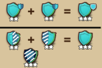
Like or hate it, the windmill has a blue roof already. It'll make the Abbey's style more in line with it. Besides that no one's forcing anyone to upgrade. If aesthetics are an important factor.
-
Dear forum reader,
To actively participate in our forum discussions or to start your own threads, in addition to your game account you need a forum account. You can REGISTER HERE!
Please ensure a translation in to English is provided if your post is not in English and to respect your fellow players when posting.
You are using an out of date browser. It may not display this or other websites correctly.
You should upgrade or use an alternative browser.
You should upgrade or use an alternative browser.
Spoiler Merge Cup spoiler discussion
- Thread starter NoVa
- Start date
Tahrakaiitoo
Marquis
For now. It is getting an upgrade level as well (the current pic is a placeholder graphic). They could be making the new one purple for all we know; with their track record it's a coin toss.Like or hate it, the windmill has a blue roof already.
If the mill remains blue, yes; but both of them will then not be in line with the bistro, pizzeria, fiore village and terracotta vineyard.It'll make the Abbey's style more in line with it.
So they're breaking apart a good looking set to create a duo of less good looking buildings; that's a loss/loss as far as I'm concerned.
That's disengenuous. Yes; aesthetics are an important factor; but so are stats.Besides that no one's forcing anyone to upgrade. If aesthetics are an important factor.
If the mill remains blue, yes; but both of them will then not be in line with the bistro, pizzeria, fiore village and terracotta vineyard.
So they're breaking apart a good looking set to create a duo of less good looking buildings; that's a loss/loss as far as I'm concerned.
To be fair, those other terracotta ones you mention are from Forge Bowl, not soccer. Soccer hasn't had much of a unifying look:
Gentiana Windmill
Athlon Abbey
Hippodrome
Altar Garden
The golden upgrade for the windmill seems to suggest otherwise.For now. It is getting an upgrade level as well (the current pic is a placeholder graphic). They could be making the new one purple for all we know; with their track record it's a coin toss.
As far we know for now it is the case and like @xivarmy mentioned they’re from different events.If the mill remains blue, yes; but both of them will then not be in line with the bistro, pizzeria, fiore village and terracotta vineyard.
That’s objectively an opinion on what’s pretty and what’s not. For some it’s actually much better looking for example. Also all other golden levels have a major different look.So they're breaking apart a good looking set to create a duo of less good looking buildings; that's a loss/loss as far as I'm concerned.
True but this is where it’s sometimes a sacrifice to the one or the other. Not something game designers can reasonably able to satisfy everyone with. Some don’t like futuristic designs like the towers of conjunction. While others living them.That's disengenuous. Yes; aesthetics are an important factor; but so are stats.
Personally I’m sacrificing efficiency for looks too. As to me I’ve drawn a line where I could beyond get much better stats but they’re offering me very little if any improvements. Where to me the luxury of choosing looks over function/efficiency can be made.
At the end of the day, imho, it’s up to yourself to chose what’s most important: stats or aesthetics. Devs can’t design everything to our personal taste.
Bosun
Farmer
Like I said before, Inno wants to make money, players want their buildings with a different look, why not let players buy "skins" for the buildings?
Both sides would be happy, but no, Inno doesn't know how to read.
In terms of looks my phantom tower would be changed to scholar, druid hut changed to lvl 9 or 6, viceroy villa to villa lvl 9, alot of my buildings would be changed while providing the best boosts.
Both sides would be happy, but no, Inno doesn't know how to read.
In terms of looks my phantom tower would be changed to scholar, druid hut changed to lvl 9 or 6, viceroy villa to villa lvl 9, alot of my buildings would be changed while providing the best boosts.
Finkadel
Marquis
Oh yeah. I seriously like terracotta style buildings most of all, they are spirit of FoE for me. It's a shame though they are mostly useless in terms of bonuses. But if I had built city for looks, I would never go into this hideous new look of Athlon Abbey... Looks like a venue for gender reveal parties...I strongly disagree. I hate the blue roof style.
It completely ruins it for me. And not only that, but these buildings had a cool terracotta roof tile thing going on; that's being ruined with additions such as this. They should at least try and keep the styles and colors intact imo. They seem to just to be adding bright ugly colors to all these gold upgrades and imo it sucks.
Previously removed assets are now back in main thread, apart from some small visual changes their names were changed merge_cup -> soccer, and some more images were added.
AllamHRK
Baronet
Is this serious? Is it serious that they will have the courage to put that gem **** mechanic in a football event????
Logic? Sense??
Apparently InnoGames completely crossed these words out of their dictionary...
And by the looks of it then, from today onwards all events will be either with that ****ty mechanic from the saint patrick event, OR with that crappy gem mechanic, is that it then? Anyway, gone are the days where events were fun, stress free... from now on InnoGames not only wants your money, it seems they want your soul too, because if you don't spend hours and hours at the event every day, for 1 whole month, you get screwed in the end.
Well, as they say, it was good while it lasted.
Tahrakaiitoo
Marquis
The part where their matching more uniform look is broken up, is not an opinion, but fact.That’s objectively an opinion on what’s pretty and what’s not.
And I think it's not that much of a stretch to say that buildings that match together nicely with their appearance look better than a hotch potch mix of a bunch of miscoloured ones.
Sure; although to me they're pretty much the same thing, really.To be fair, those other terracotta ones you mention are from Forge Bowl, not soccer.
It’s still an opinion. The golden level series all feature a different roof colour. The exception are the tower of conjunction series. The design and colour of those golden level buildings is objectively an option.The part where their matching more uniform look is broken up, is not an opinion, but fact.
And I think it's not that much of a stretch to say that buildings that match together nicely with their appearance look better than a hotch potch mix of a bunch of miscoloured ones.
While I agreed that buildings similar in appearance are looking better than a wild mix, it remains an opinion. Some may prefer chaotic combinations, others don’t.
Updated main thread, new kits were added and some assets got an update - minigame backrounds, cheat sheet, "gems" are now players with proper names and "keys" changed into badges.
Tahrakaiitoo
Marquis
You're misunderstanding. I'm NOT commenting on it looking better.While I agreed that buildings similar in appearance are looking better than a wild mix, it remains an opinion. Some may prefer chaotic combinations, others don’t.
I'm commenting on the FACT that they're breaking up the uniform look of a selection of buildings.
Nothing about that is opinion. It's a cold, hard fact.
I'm not even calling it bad or good (even though it's my OPINION that it's very bad).
@Tahrakaiitoo you're misunderstanding me, it's about this:
Regardless the changing appearance, particularly the roof's colour, shouldn't come as a surprise. Most other golden levels changed the roof colour and in some cases the appearance of buildings. That's also a fact. Like or hate that fact, that's the way things are.
That are my points. I get it that you don't like the renovated appearances and seeing it as a loss/loss. Particularly in cases in which the buildings receiving golden levels are part of a themed part of one's city.
It's an opinion that the golden levels are less good looking and deriving from that, that the golden levels' aesthetics are unappealing resulting in a loss/loss.So they're breaking apart a good looking set to create a duo of less good looking buildings; that's a loss/loss as far as I'm concerned.
Regardless the changing appearance, particularly the roof's colour, shouldn't come as a surprise. Most other golden levels changed the roof colour and in some cases the appearance of buildings. That's also a fact. Like or hate that fact, that's the way things are.
That are my points. I get it that you don't like the renovated appearances and seeing it as a loss/loss. Particularly in cases in which the buildings receiving golden levels are part of a themed part of one's city.
Tahrakaiitoo
Marquis
Ah! You were still referring to my original remark, while I was talking about a later one.
Glad that's cleared up.
Anyway... For me it has put a huge damper on my enthusiasm. And that means I'm not spending money.
Glad that's cleared up.
Anyway... For me it has put a huge damper on my enthusiasm. And that means I'm not spending money.
ArklurBeta
Baronet
Can agree, though at least the difference in levels are much better. Maybe it was "just me", but I did have some issues with differentiating the levels from eachother. It wasn't that bad, but...it wasn't as clear as I think it should be.
I think what they could do is simply drop the index icon from the icon and just use the "big" icon to show which half it is:
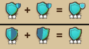
I think what they could do is simply drop the index icon from the icon and just use the "big" icon to show which half it is:

Don't forget there are also ones without a half. And differenciating the different colors there would be very difficult.Can agree, though at least the difference in levels are much better. Maybe it was "just me", but I did have some issues with differentiating the levels from eachother. It wasn't that bad, but...it wasn't as clear as I think it should be.
I think what they could do is simply drop the index icon from the icon and just use the "big" icon to show which half it is:
View attachment 9823
ArklurBeta
Baronet
Share:
