• Dear forum reader,
    To actively participate in our forum discussions or to start your own threads, in addition to your game account you need a forum account. You can
    REGISTER HERE!
    Please ensure a translation in to English is provided if your post is not in English and to respect your fellow players when posting.

Rejected Stacking units slight improvement.

Status
Not open for further replies.

-Alin-

Emperor
Reason
It will make selecting units even smoother.
Details
Just move the injured units at the end of each era general tab.
Balance
It will improve the selecting units, no more scroll needed, it will not impact any other aspect of the game since You still have to swap injured units with newer ones for every harder fight.
Abuse Prevention
No abuse.
Summary
It will improve the smoothness of selecting units.
Have you looked to see if this has already been suggested?
Nothing about it.
Today we received the update for stacking units, and it comes handy for both PC and phone, but there is a slight issue.
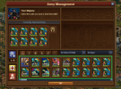
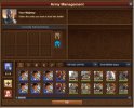
The injured units are still shown after the main stack of units, it would be nice if all the injured units will be moved at the end of the same era general tab of units.

The photo describes better what I mean.
From:
image-104.png
To:
1681997150007.png
 
Last edited:
This suggestion has been closed. Votes are no longer accepted.

Kronan

Viceroy
Big echo on this from a lot of people doing early reviews, so I concur.

There really should be a split FIRST before the sort. Split on FRESH (uninjured) UNITS TYPES as a primary value, then put injured units after ALL the fresh have been evaluated.
 

-Alin-

Emperor
even better would be: hide damaged units


not 20: ALL of them

can be hundreds or even thousands

Oh, I thought only 20 were shown, I counted them and I had exactly 20, but I did now some more fights and are more than 20 grenadiers injured, so you are right.
Edited the text, thank you.
 

Magenta

Farmer
I think the best update since auto-aid

But it would be great if you could also save us from city defender army being on constant display by occupying the most important slots that attackers should be using!

In PvP we place defense and those defending units never show up on our regular unit tab. The same should be done for city defending units.

I was thinking something like depicted in the mock up image could be done. After all it is obvious more tabs were intended but nothing was ever done.

EDIT:
Sorry, mistook this for feedback thread.

But I do agree with NinjAlin, they should either be placed as suggested or maybe placed outside general tab (under their dedicated tab) so they do not interfere with the attacker selection process in any way.
 

Attachments

  • defense tab.jpg
    defense tab.jpg
    154.4 KB · Views: 10
Last edited:

SlytherinAttack

Viceroy
Baking Sudoku Master
Proposed idea is only for general tab.
Requested suggestion is completely breaking the general tab grouping or sorting logic of army units (age and type).

I don't understand why it needs to move to the last position. If you have 1000 full health unit, after doing excessive battles all 1000units damaged and wanted to scroll to last to continue with less damaged units. What was the benefit in doing this way.

Current approach is very fine, and please appreciate, they already stacked 1000+ full health units which improved scroll like anything. Also, giving the damaged unit in a order like less damaged unit up-front it will be easy to try few more battles without scrolling.

Initially I too thought, hiding injured and defending units will be good. But realised, hiding defending units only serve the better approach on the mobile app. You people are thinking in the aspect of clicking on the stacked units and scroll, as a mobile player If this implemented, I need to touch and scroll to last position to use the damaged unit from the general tab. As an example, assume having only 2 full health heavy units and 2 damaged heavy units and 2 rogues full health and 4 rogues damaged units. How you guys perform in PC, first 2 clicks on full health units and 2 clicks on rogues if it is visible without scrolling, and then big scroll to the last position to pick the damaged units like 2 clicks for damaged units and 4 clicks on rogues. So totally, 2+2+2+4+one big scroll with the proposed idea. But with current approach, 2+2+2+4 without scrolling which is a benefit for lower level players. Your counter argument, damaged units will be more and more scrolls will happen. Yes, that's how general tab supposed to work. In that case, use the heavy unit tab in the army window to handle damaged units easily. For sure, many pc users will not agree with me. You guys never dragged a unit in the army window to know the pain till today. So hiding injured units should not be delivered to PC users at any cost:(
 

SlytherinAttack

Viceroy
Baking Sudoku Master
browser players can make suggestion to improve their game
That's the main issue. Mobile and PC players join hands together and fights against each other in the game. PC is very much easy for doing battles when compared to mobile.

Steve jobs died long back and no one to support mobile touch functionality in the army management screen.
 

DEADP00L

Emperor
Perk Creator
Here's what I'd rather have:
Sugg2.png


Only troops with full health accessible in the selected age (here FUTURE) appear with the quantities.
Wounded troops would only be visible by clicking on the type of troops at the top left (light, heavy, fast, ...)

So no big change in the coding but above all a simplification of use and appearance.
 

Emberguard

Emperor
Here's what I'd rather have:
[image]


Only troops with full health accessible in the selected age (here FUTURE) appear with the quantities.
Wounded troops would only be visible by clicking on the type of troops at the top left (light, heavy, fast, ...)

So no big change in the coding but above all a simplification of use and appearance.

It needs to be available on the main tab, not just in the unit typings. It could definitely be improved, but a permanent removal is no good as it would cause far too much confusion

Players already can’t find their PvP Arena units and freak out on where their units disappeared to because of that. If you disappear their entire army because it got wounded you’re just going to make everyone frustrated on why they suddenly have no units
 
Here's what I'd rather have:


Only troops with full health accessible in the selected age (here FUTURE) appear with the quantities.
Wounded troops would only be visible by clicking on the type of troops at the top left (light, heavy, fast, ...)

So no big change in the coding but above all a simplification of use and appearance.
Why would you want it to display units you don't have? Just show the units you have. I wouldn't mind if injured units went to their unit type tab though.

+1 for OP's idea.
 

Velvet Thunder

FORUM MODERATOR
Beta Moderator
Please post this in the feedback thread (if you have not done already) so that it reaches the developers in a more timely manner.
 
Status
Not open for further replies.
Top