• Dear forum reader,
    To actively participate in our forum discussions or to start your own threads, in addition to your game account you need a forum account. You can
    REGISTER HERE!
    Please ensure a translation in to English is provided if your post is not in English and to respect your fellow players when posting.

Implemented Army Management Dialog - New Tab for Stacked Units

Status
Not open for further replies.
Reason
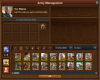
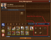
Reduce or eliminate required scrolling to find units, allowing for easier and faster loading of units. The best examples are finding champion and rogue units, which usually requires varied amounts of scrolling. This would especially enhance quickly loading units for guild battlegrounds, and potentially reduce player error when attempting to load or replace units quickly while having to scroll.
Details
Clicking the slot for the unique unit type would load the unit into your army, as done with current slots on other tabs. If another unit of the same type is available, the slot will display the next unit, using the existing sort that lays out units in the other existing tabs. Healthy units first, damaged after. If a unit is not available, the slot could display empty. An empty slot could display the existing icons from the tabs.
Balance
The balance change I imagine would be that players in guild battlegrounds with low boosts who need to replace units more often would be able to do so faster, potentially keeping up better with players having high boosts that may not need change units often. Regardless, a player with high boosts could still replace their units faster using this.
Abuse Prevention
I can’t envision this creating any new type of cheating.
Summary
As it is probably well known, loading special units requires scrolling. Only when “all ages” is selected, for a player in a higher age with a high number of unit types, would they have to scroll to find units on this type of tab. If the existing age filter is not set to all ages, every type of unit could be displayed without any scrolling needed. To ease creating the sample showing all the “early middle age” types, I did not apply the apparent filter that is used by tabs currently to the sample EMA units. *Note after searching, putting a number to represent how many units of a type is a good idea.
Have you looked to see if this has already been suggested?
Not with a good implementation.
Visual Aids
[ATTACH type="full"]7759[/ATTACH][ATTACH type="full"]7760[/ATTACH]
Add a new tab to the army management window for all units with a single slot per unique type. This can implement previously proposed ideas for “stacked units”. The core of this would be to click the single slot for a unit type to load it, so filling a full army with a single type would mean clicking the single unique slot 8 times.
 

Attachments

  • MockUp.png
    MockUp.png
    477.4 KB · Views: 75
  • MockUpTwo.png
    MockUpTwo.png
    460.7 KB · Views: 76
This suggestion has been forwarded. Votes are no longer accepted.
While I did think this through, it seemed as though showing empty slots when the player didn't have those types was good. But probably just not showing the slot at all might be better.

*Edit: Not sure why anyone would not like this, but if you vote no it would be nice to hear your point of view as to why. It would not change any functionality that is already available, just add more.
 
Last edited:
I am pretty sure I have read a similar Idea before - most likely one the German forums
Yes, that is true. When searching for similar/same I found several ideas about stacking units. None of them had a way to implement this while retaining all the current features that are available. When I thought of this, it was all about not having to scroll so much to find units, to speed up reloading or replacing units.
 
But only 6 columns instead of 9
If you mean how many columns there are in the available units, that would vary depending upon how many types you had available and how the age filter was set. It may still have to scroll if you are in a higher age and have many types of units in inventory.
 

Yekk

Viceroy
Excellent idea. A 1 to 99+ counter in a corner of each type showing remaining troops would be nice. Coding is a piece of cake and would most likely actually save bandwidth.
 

Ironrooster

Baronet
Yes
Since this is only activated with the a new tab and all the old tabs/capabilities are still there, I like it.
Picking your army will be more efficient as well as quickly seeing what troops you still have from older ages.
 
Since I cannot see any advantage here, why should I use so many units of different ages. This is only interesting for players who play PvP and want 1st place in all towers or GvG. Especially as an app player, there is only one row available in the army selection, so it would not be implemented for lack of space. I can only support the stacking of the healthy units with a counter in the upper corner. However, I would like to be able to see units that are injured in order to be able to assess when they are ready to fight again.
In its current form, I give it a clear no, because the app players are excluded.
 

Balinor

Steward
Been suggested many times in different ways but all want same thing
Easier access to rogues in army management screen
Never going to happen
 

Yekk

Viceroy
Been suggested many times in different ways but all want same thing
Easier access to rogues in army management screen
Never going to happen

Rogue access is easy.. just delete/use your light troops up...

The idea is good and its time is now... BECAUSE having to delete your light troops is not...
 
Since I cannot see any advantage here, why should I use so many units of different ages. This is only interesting for players who play PvP and want 1st place in all towers or GvG. Especially as an app player, there is only one row available in the army selection, so it would not be implemented for lack of space. I can only support the stacking of the healthy units with a counter in the upper corner. However, I would like to be able to see units that are injured in order to be able to assess when they are ready to fight again.
In its current form, I give it a clear no, because the app players are excluded.
The main advantage is not having to scroll to find units. This can speed up loading/replacing armies more so in guild battlegrounds than anywhere else. There would be some small advantage to players with lower bonuses in keeping up with players having high bonuses. PvP is not time restrictive so if you don't mind scrolling you can spend as much time doing that to load armies as you like. This would require stacking of units and having a number would be beneficial and I would support that being done. You could still see injured units on the other tabs as you can today, but you cannot see injured units in a stack as it would only show the most healthy unit. Do app players not have the army management dialog in the samples? If they do, it should work the same for them. Also you should bear in mind that using the app already has some restrictions such as no access to GvG.
 
Been suggested many times in different ways but all want same thing
Easier access to rogues in army management screen
Never going to happen
Not just rogues but the other special units as well, champions, drummers, color guards. Note also in EMA if you have a lot of barbarians you have to scroll past them to get to your "normal" heavy units. Or scroll past your normal ranged to get to the slingers.
 
The main advantage is not having to scroll to find units. This can speed up loading/replacing armies more so in guild battlegrounds than anywhere else. There would be some small advantage to players with lower bonuses in keeping up with players having high bonuses. PvP is not time restrictive so if you don't mind scrolling you can spend as much time doing that to load armies as you like. This would require stacking of units and having a number would be beneficial and I would support that being done. You could still see injured units on the other tabs as you can today, but you cannot see injured units in a stack as it would only show the most healthy unit. Do app players not have the army management dialog in the samples? If they do, it should work the same for them. Also you should bear in mind that using the app already has some restrictions such as no access to GvG.
There are a lot of players who come to FoE via the app, so for them GvG is not an issue. Of course there is a selection window for the army, but much smaller and with less information.
 

Attachments

  • IMG_44CB8AD3BA1B-1.jpg
    IMG_44CB8AD3BA1B-1.jpg
    166.4 KB · Views: 20
There are a lot of players who come to FoE via the app, so for them GvG is not an issue. Of course there is a selection window for the army, but much smaller and with less information.
It's very similar, a new tab with stacked units should allow for less or no scrolling in that dialog. If the filter by age was set for a specific age it would show every unique unit without scrolling, with the exceptions being ages with more than 9 unique units. To me it is more about getting rid of the scrolling, which having stacked units on a new tab could accomplish. Also, if done on a new tab, existing features would be retained.
 
When I look at Mockup2, you still have more slots there with the Additional Unit Type display than we app players do. When I click on the units tab, I can already quickly select my units, who needs to have units from several ages, only a minority needs them, a pity for the time of the programmers.
 
When I look at Mockup2, you still have more slots there with the Additional Unit Type display than we app players do. When I click on the units tab, I can already quickly select my units, who needs to have units from several ages, only a minority needs them, a pity for the time of the programmers.
Mockup2 shows all the unique units for early Middle Ages as an example of how many there can be. I include blank slots as an example if it were to show those for unit type a player does not have. I was just lazy and did not do a third, otherwise #2 would only show the units and the rest would be empty. If I had done a third showing a player with no units available at all, those blank slots could have been placeholders. Honestly in retrospect I think NOT showing blank slots would be better and in that case those should be disregarded. On the app as you posted, there are too many unique units to show in those 9 visible slots, you would still have to scroll to see the last 2 types. But at least it would be minimal. I play in a browser on PC, that is why there are 2 rows of units instead of 1. If I were to play on the app with 1 row, I would have to scroll even more than I do now, so this leads me to think many app users could benefit from this.

Imagine if there were no special units, in that case the new tab would only show at most 5 slots for the 5 basic unit types, stacked preferably with a number representing how many you have. You could load an empty army space tapping the wanted slots 8 times, or the same slot 8 times, loading your most healthy unit from each slot tapped.
 
Last edited:
Status
Not open for further replies.
Top